OfferUp Premium: Freemium-to-paid conversion
How experiments every sprint doubled sign-ups in one month for OfferUp's first paid membership, compared with the previous six months combined.
Result: In one month, Premium sign-ups doubled compared with the previous six months combined, and continued to grow month over month.
Problem: OfferUp, a mobile marketplace for buying and selling locally, needed to launch its first paid membership and convert free buyers to paid, on an aggressive Q1 timeline with no brand or content defined.
Role: Design Director, managing a team of 6+ across product and marketing design. I led design end to end, from strategy and customer journey to team and process, while staying hands-on with visual design and copywriting.
Approach:
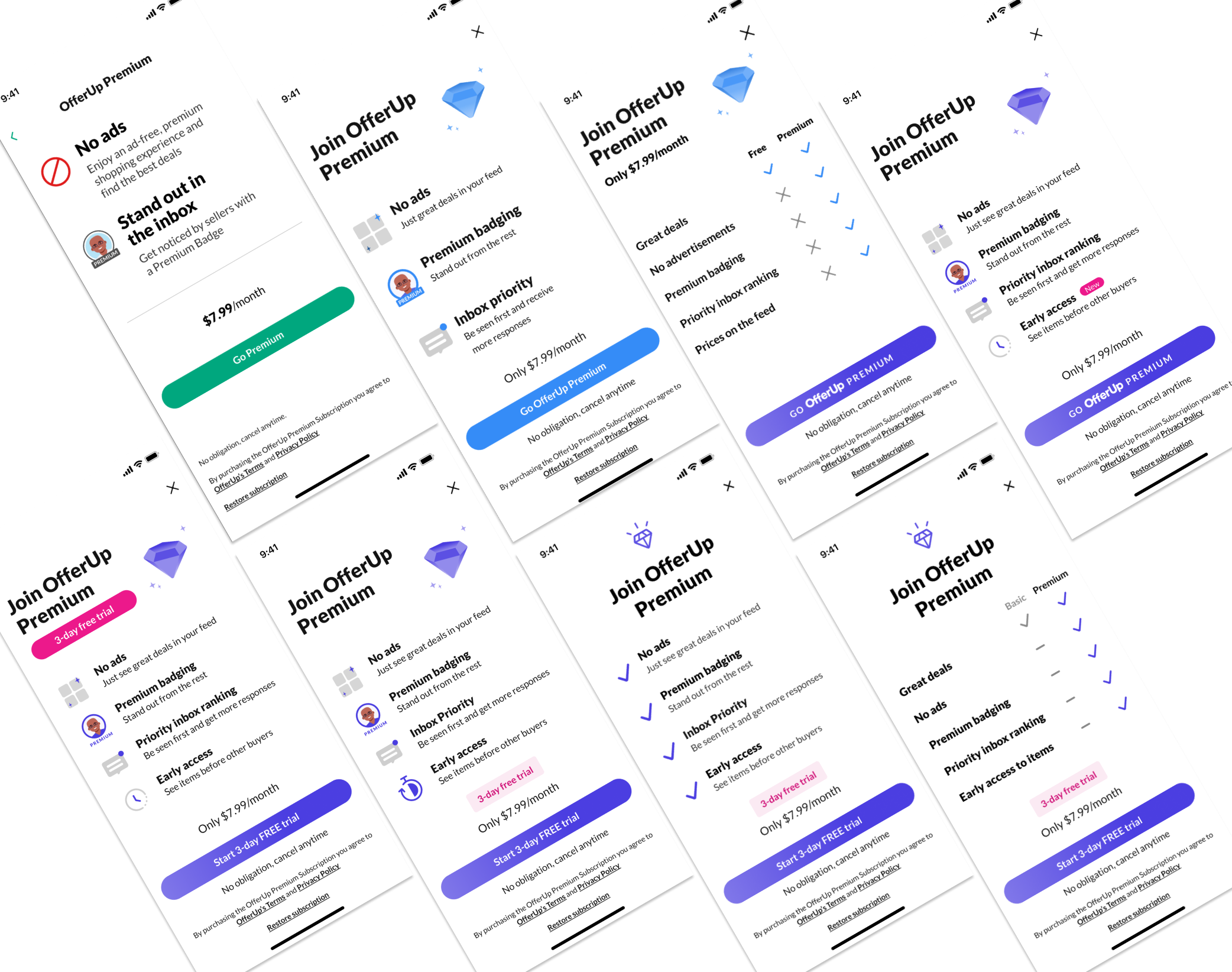
Ran experiments every sprint with Product and Engineering on layout, copy, CTAs, value props and entry-point placement.
Mapped winning entry points to winning landing pages, then added 3-day free trial placements.
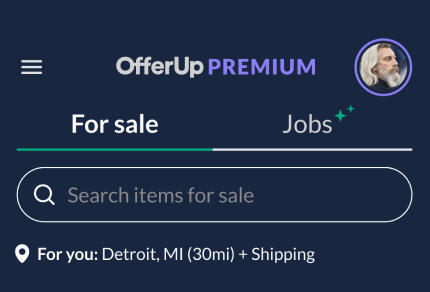
Built a Premium brand and color system, accessible in light and dark mode, that stood out without disrupting the core app.
Monitored downstream effects across experiments in Statsig.
Skills shown: 0→1 launch, subscription conversion, experimentation at scale, design leadership.

Premium is an exclusive membership product that removes friction in the shopping process and connects buyers and sellers faster.
How we did it: Launching before the brand existed
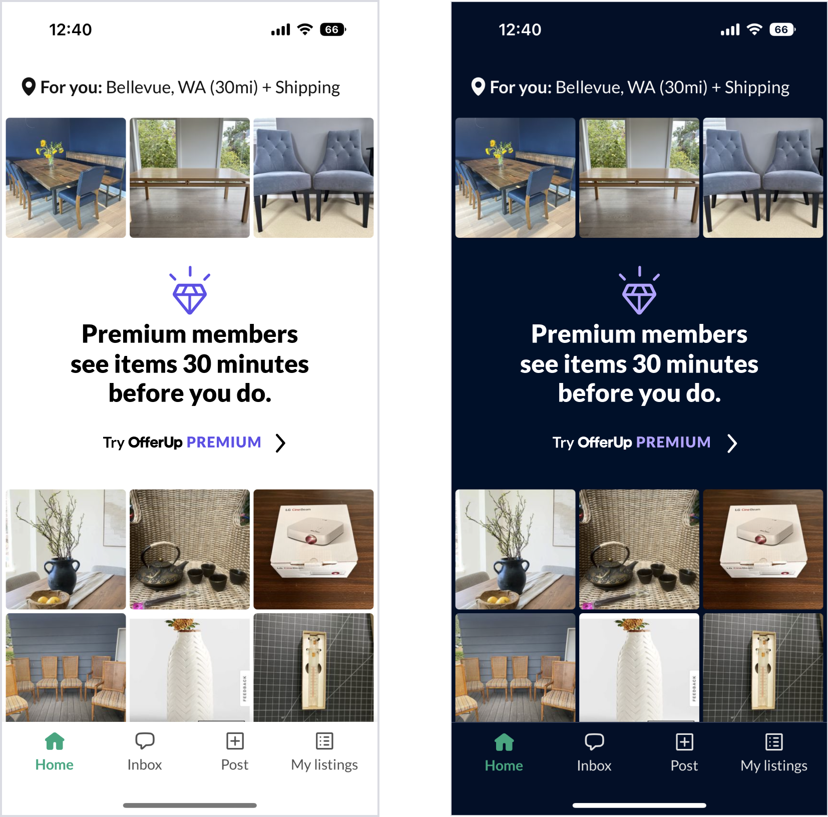
Aggressive Q1 timelines meant launching without branding or content defined, so we built the plane while it was heading down the runway. I led the team through in-app experimentation while developing a Premium look and feel that would stand out in buyer flows and celebrate the benefits, without disrupting the core app experience.
Our process: methodically iterate to optimize the design Aggressive Q1 timelines dictated a launch with without branding or content defined, so we'd have to build the plane while it was heading down the tarmac.
I led the design team through in-app experimentation while developing a brand look and feel that would stand out in the buyer flows, and celebrate the benefits to users (without causing significant disruption to the general UI experience).
I worked in lock-step with Product and Tech to schedule experiments to run in every sprint so we could methodically iterate on layout design, copy, brand elements, CTA language and entry-point placement. Then we would map winning entry points to winning landing pages to validate our assumptions. Boom!
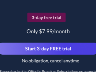
Around the end of Q2, I personally conducted a quick refresh of the brand elements tightening up the look and feel in the UI, emails, ads, and with my product partner, introduced "3-day free trial" placements and remapping of entry points to winning landing pages. The results were rewarding: In one month alone, we were able to double the number of sign-ups compared to the cumulative number of sign-ups from the prior 6 months.

Mapping placement of creative assets to test value props that flow to landing / upsell pages
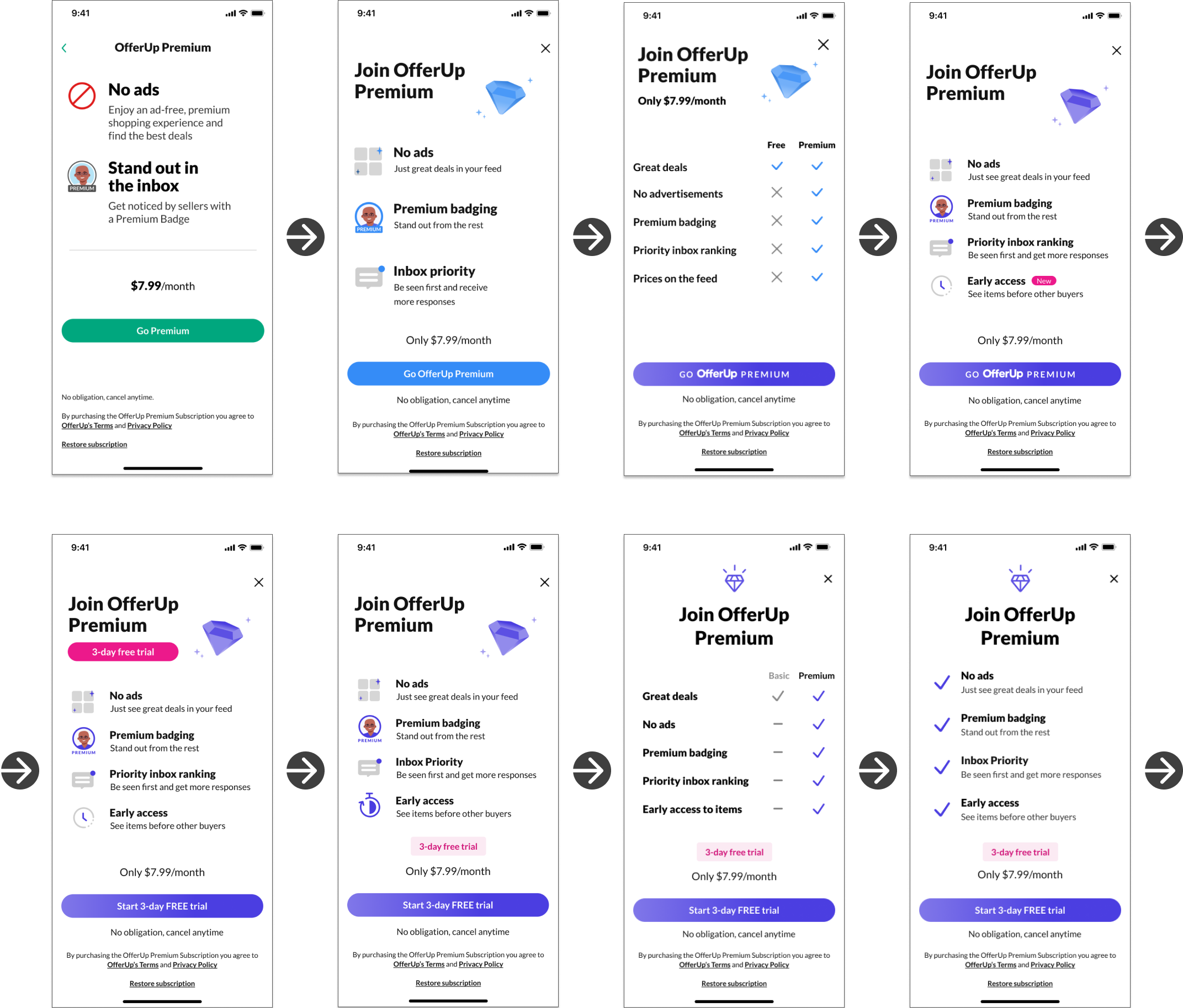
Landing page strategies leverage choice psychology, copy, content, and pricing tests, highlighting value props in the headlines and copy. Reordering val props, entry points, and so on. Constantly nuancing to achieve maximum conversion.
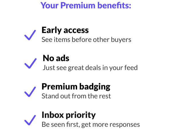
Metrics collected from StatSig keep us informed of the impact to other experiments so we can avoid any unwanted downstream effects. Symbiotically, the findings from research and data led us to introduce more value props, which aded to even more sign-ups. Woo hoo!

I defined a brand color system that complemented OfferUp green to stand out in the app, and had to be accessible in light and dark modes
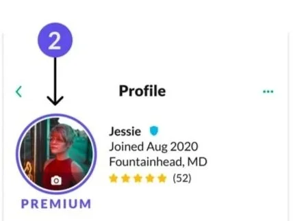
Badging was developed to meet user expectations of a Premium identity

Value proposition alternates were tested rigorously
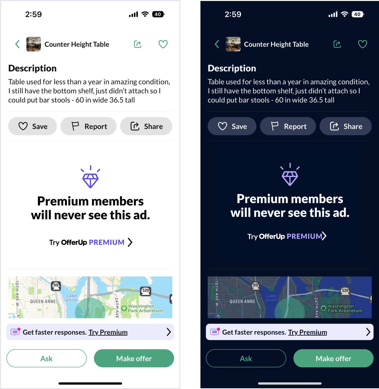
All designs were tested in light and dark mode to develop the design system and color strategy
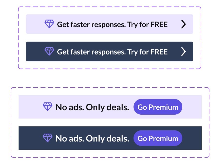
Even ads get the color-treatment tests
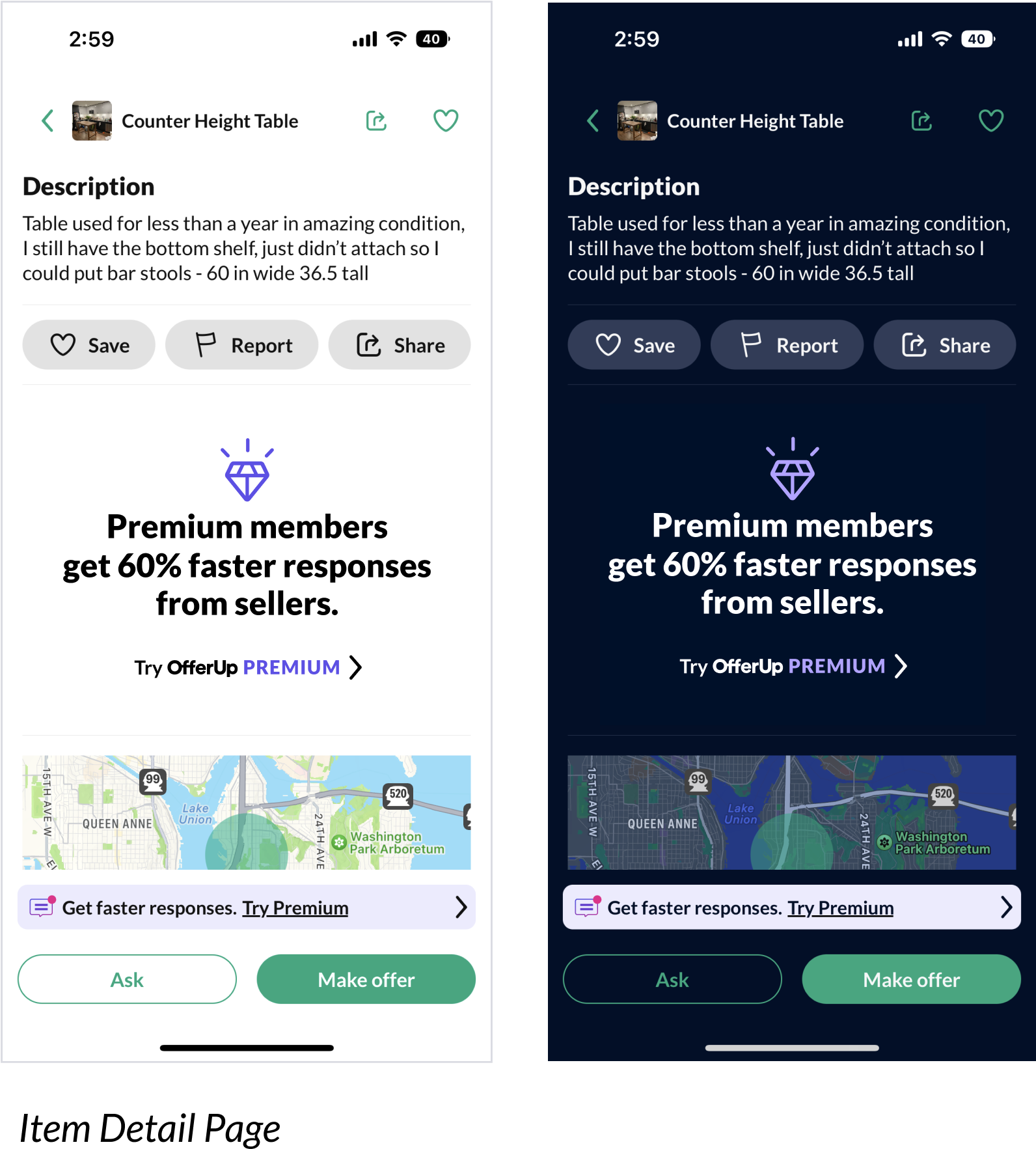
At the time, we didn't have a copywriter so I wrote most of the copy as well
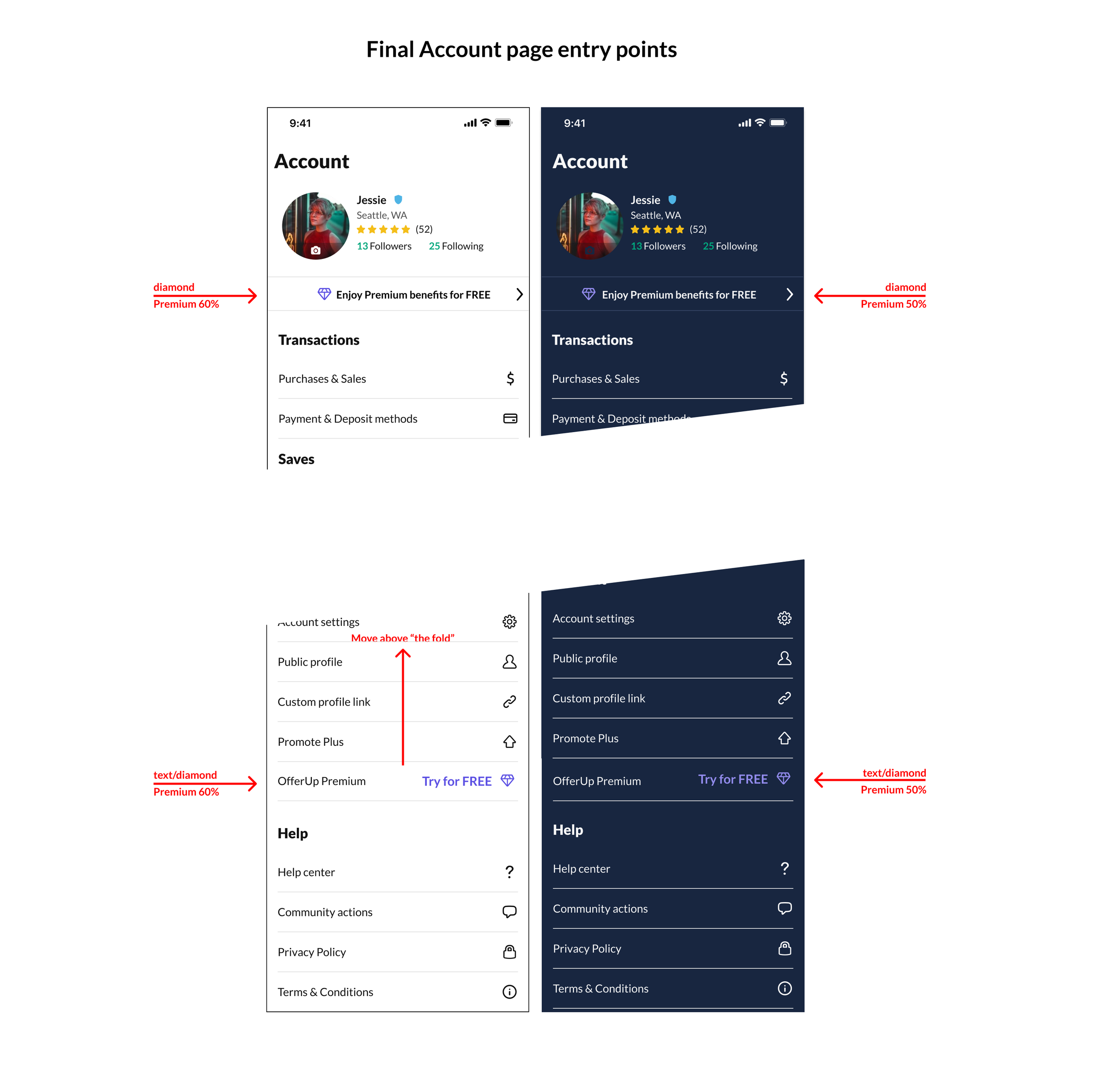
We strategically placed dozens of entry points to the conversion flow and optimized language for CTAs
What drove the result
At the end of Q2, we refreshed the Premium brand across the app, emails and ads, introduced 3-day free trial placements, and remapped entry points to the winning landing pages. Within a month, sign-ups doubled compared with the previous six months combined. Research findings then led us to add new value propositions, which continued to grow sign-ups month over month.