Library of Congress: a massive redesign of a complex system of pages
Unified navigation, faceted search and a design system that made decades of content easier to find on LOC.gov, a site with 86 million visits in 2015.
Result: I led the design team behind LOC.gov's unified navigation, faceted search and template system, for a site that drew 86 million visits in 2015. Together, we gave users consistent access to key resources from any entry point and surfaced content previously buried deep in one of the world's largest cultural websites.
Problem: Over decades, LOC.gov had grown massive and unwieldy. Library divisions had built their parts independently, without shared design standards or user-centered expertise, so content was hard to find and understand for members of Congress, researchers, teachers, students and the public.
Role: Art Director, then Creative Director, managing a team of 10+ across UX design and research. I guided the team in defining a scalable system of templates, design patterns, visual language, interactions and documentation, and aligned stakeholders across program offices, the Congressional Research Service, communications and the Office of the Librarian.
Approach:
We established a common framework for global navigation and menus across the site.
We architected a new object-oriented faceted search and made it a strategic centerpiece of the experience.
We designed a template system for objects, formats and collections, replacing fragmented one-off pages with shared components that reduced maintenance.
I led qualitative and quantitative research to build evidence for stakeholders and connect user needs to Library priorities.
Skills shown: Discovery and search, information architecture, design systems at scale, team leadership, complex stakeholder alignment.

We kicked off a years-long program to methodically unify the Library’s web properties, leveraging new architecture, design systems, providing users with ubiquitous, consistent access to key Library web resources from any page on the site, regardless of user entry point
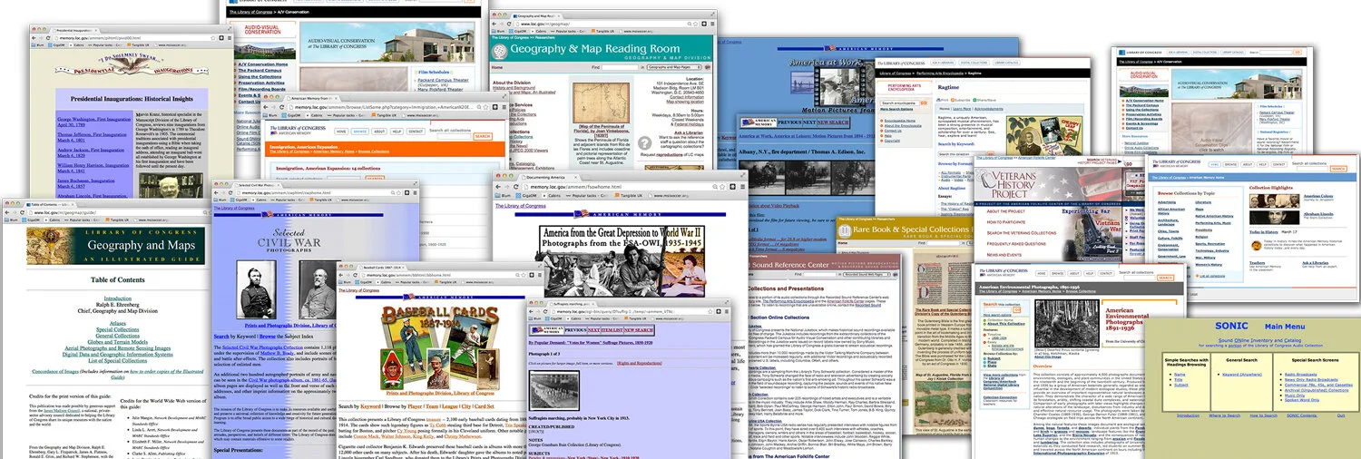
LOC.gov suffered from a lack of shared UI patterns, visual design and branding making for a disjointed user experience. Many of these problems were caused by various divisions of the Library acting independently without any knowledge of what others were doing.
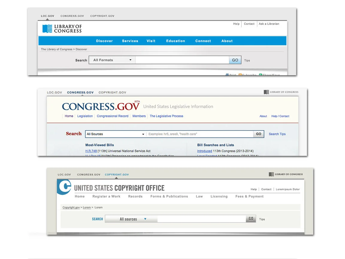
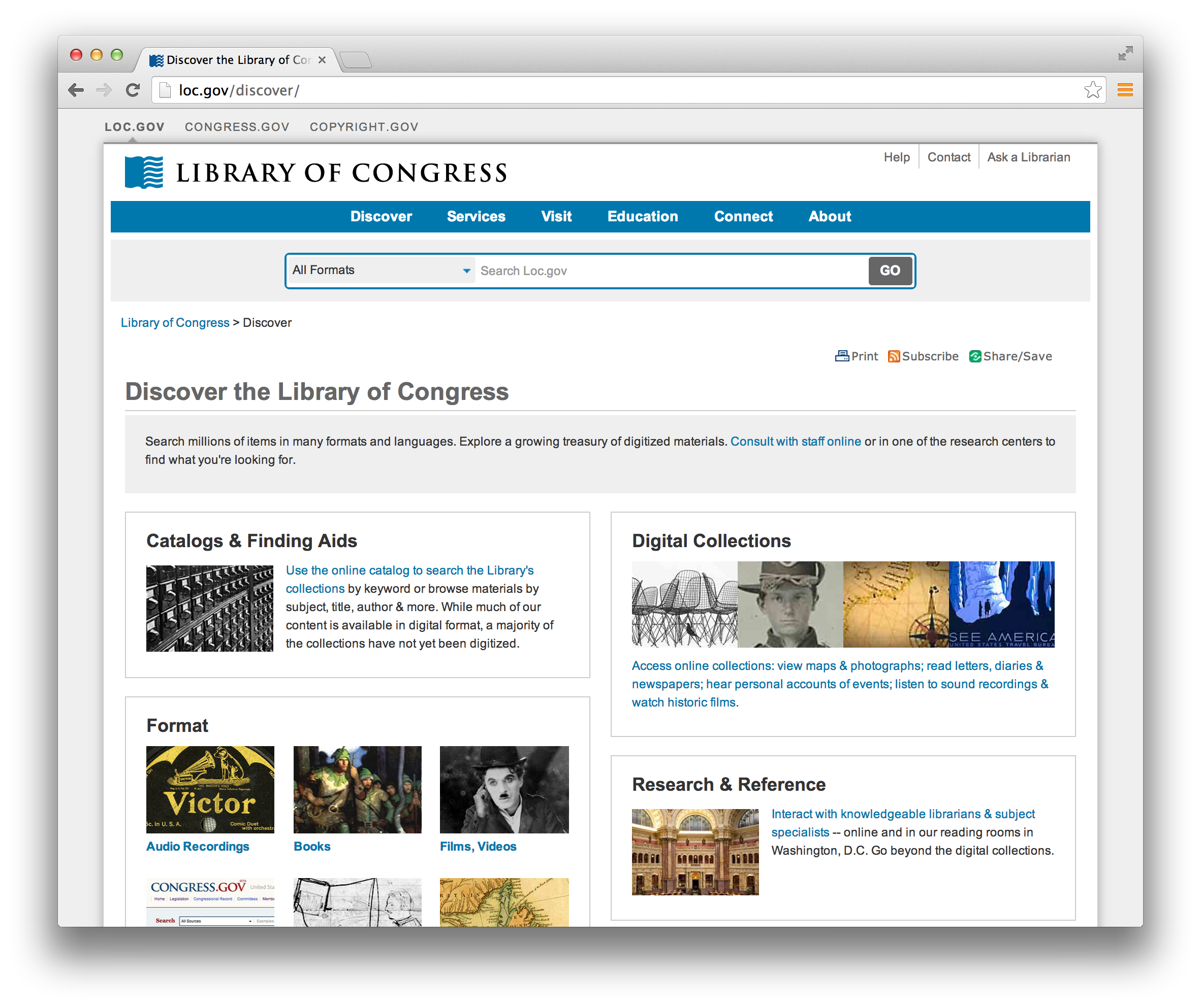
A quick win with high value: design a header to unifying the Library’s main properties. Many visitors of the Library’s websites were not aware that LOC.gov, Congress.gov and Copyright.gov all live under the same roof on Capitol Hill. This simple solution defines the site's organization and provides users with an overview of diverse Library content and services at a glance.
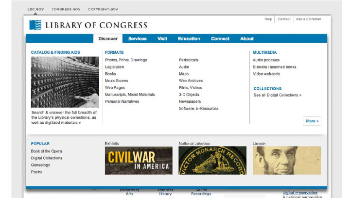
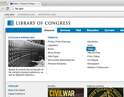
Establishing a common framework for global navigation and menu was a usability no brainer. The new mega-menu provides additional exposure to Library content, programs, and services currently hidden deep in the Library’s large web site. Plus it provides users with ubiquitous, consistent access to key Library web resources from any page on the site, regardless of user entry point.
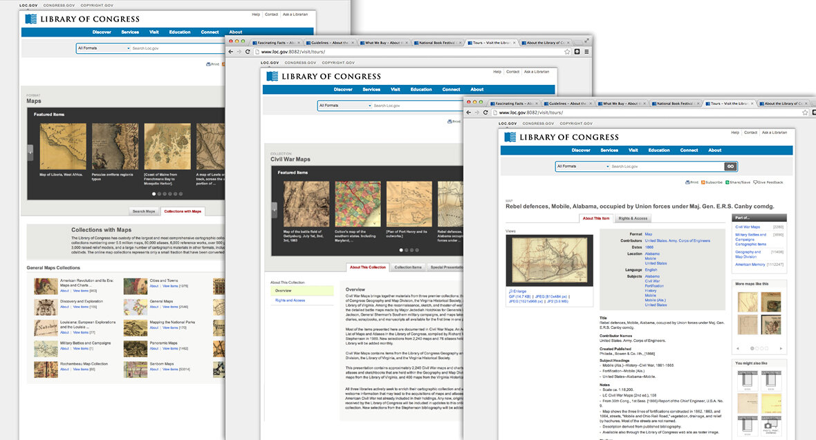
A template system for objects, formats and collections provides users with better context and relational content. For the first time ever, the Library’s content had been organized with an architecture that leverages meta tagging to connect objects to one another, creating logical hierarchy and nesting within collections, and provides high opportunity for discovery through “related” objects. Reduces maintenance and management burden by creating a single set of common components to manage and upgrade.
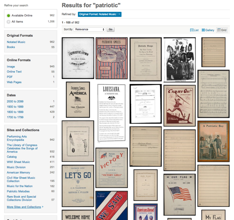
A new object-oriented, faceted search paradigm is a powerful and fast way to get specific results. Another “first” for the Library. Object-oriented search based on existing meta data provides users a powerful, new way to filter their results, and preview an item before linking to the object detail page. This template system provides users a context for all digitized items as a stand-alone object, as a part of multiple other collections, and belonging to a set of similar formats as well.
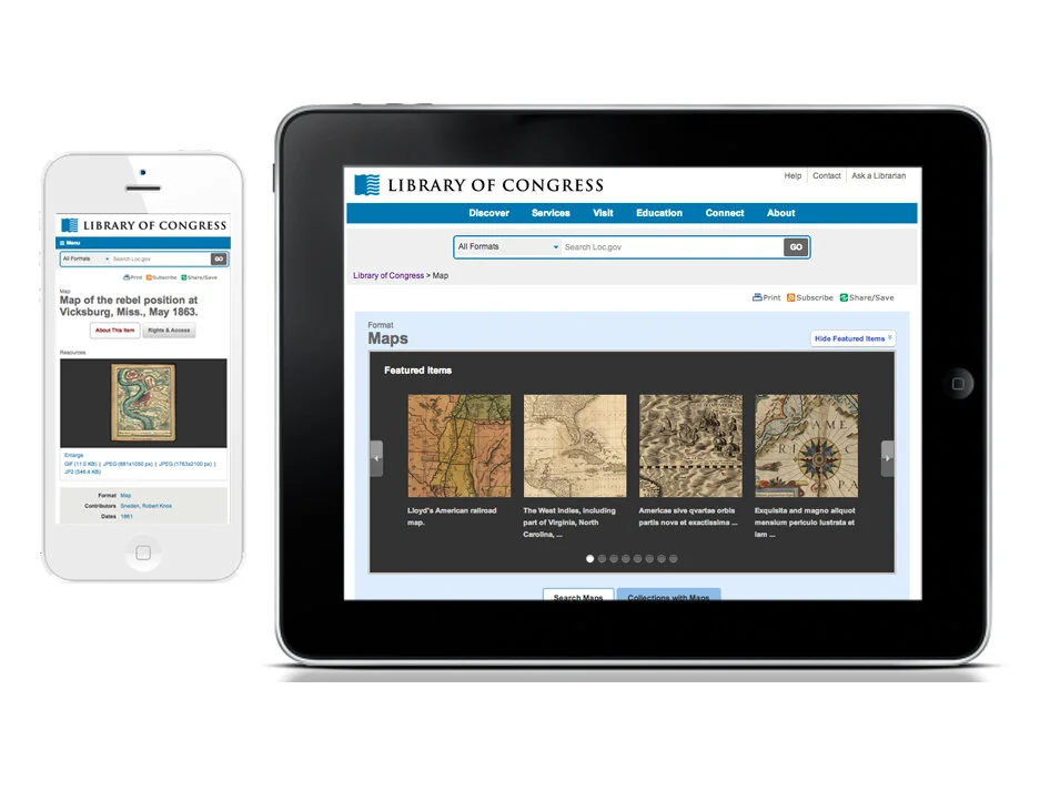
Designed to be flexible and scalable across devices, from desktop to mobile, maintaining visual design integrity.
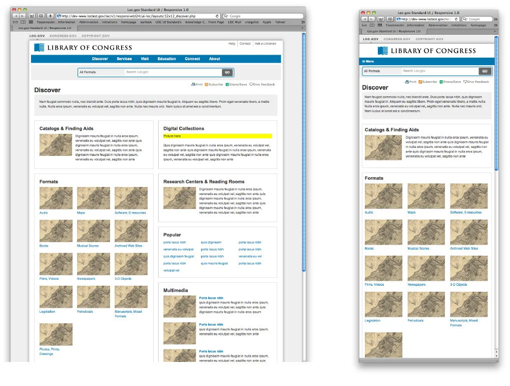
Modular templates: Defining break points for responsive design. Once the templates were built with CSS and HTML5, we worked closely with developers to noodle and tweak the images and captions, defining break-points and hierarchy of page elements.
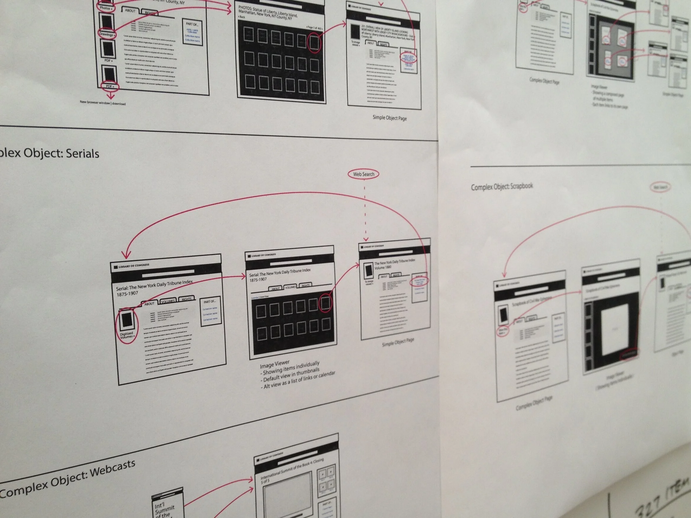
Working out interaction patterns for collections of objects. Many items in the Library also belong to collections, there is now a landing page where users can browse items in a specific collection. These collections describe the inter-relationships within a group of objects, and also link to other objects and other collections those objects belong to.
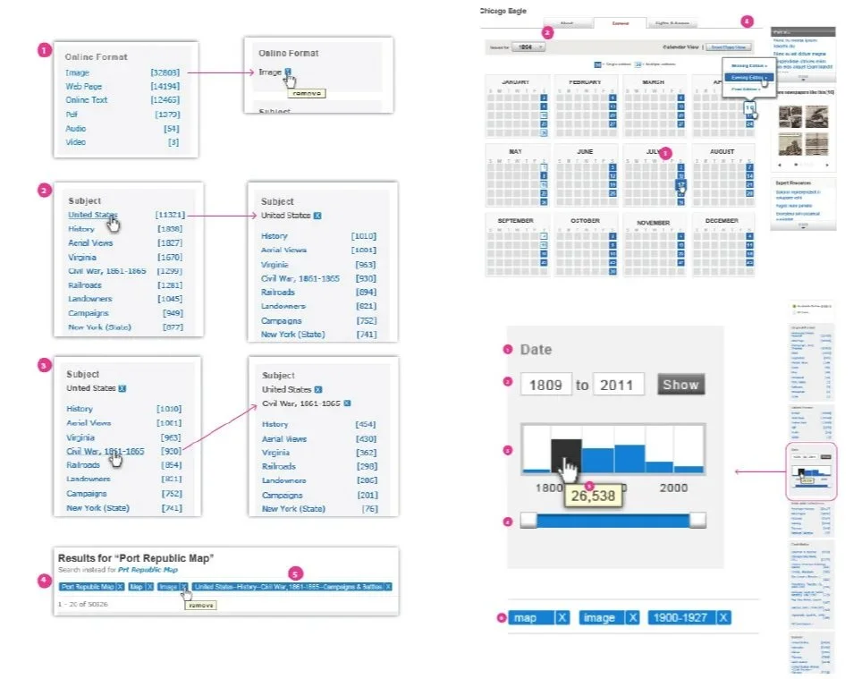
Documenting interaction models in a complex search paradigm. For many complex operations, I worked with users and developers to define interaction models and design patterns providing detailed documentation as functional specifications in high-fidelity wireframes.
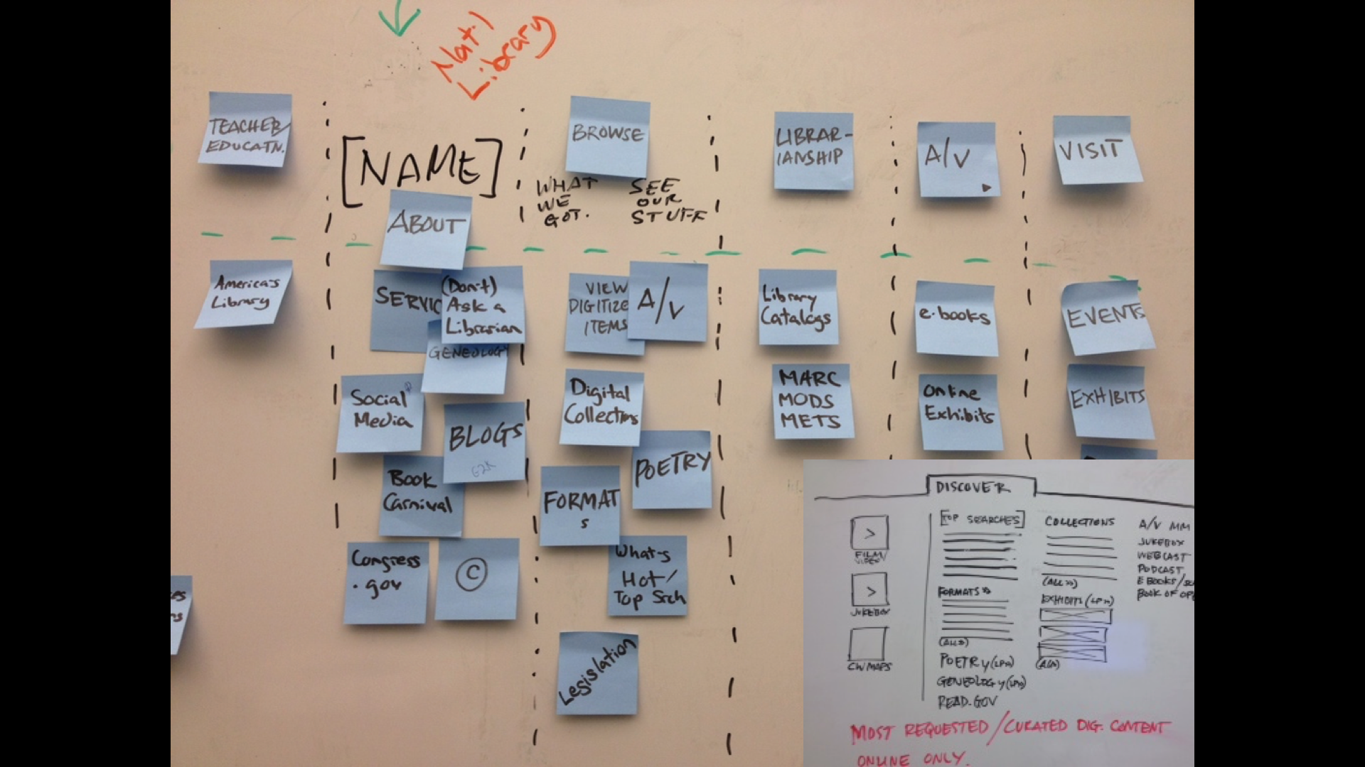
Top down and bottom up - balancing business requirements and user needs. The new global navigation for LOC.gov reflects destinations of the most searched terms (user-driven) mixed in with curated links (business mandated), but was not designed to reflect the structure of the Library as an organization. Usability testing helped us get to a final working model that meets user needs.
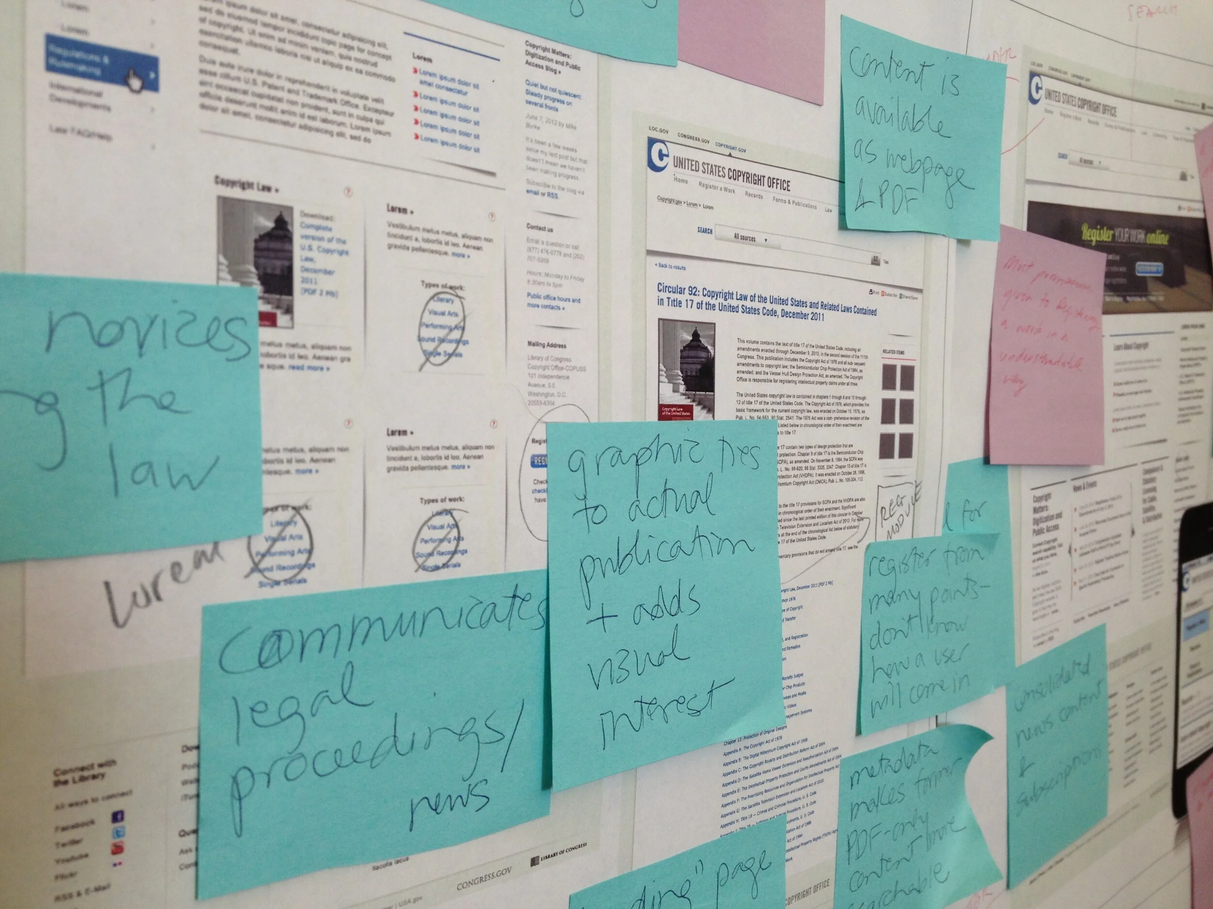
In a politically-driven environment, posting our work to crowdsource feedback from our peers keeps us honest and transparent. I have always been a big fan of sharing our work with neighbors and peers do get a different point of view. People would walk by our hallway all day long, stop and take a look, and post comments to our work. Not a very common practice on Capitol Hill.
We partnered with the National Library Service for the Blind to ensure accessibility for all.
LinkedIn, Twitter, Facebook, and blogs. Unified across social media channels, Library curators can now share fascinating facts and expertise with a personal voice to the masses.